I have now been using Apple's document creator/editor Pages on my iPad 2 for about a week. Here's a quick rundown of what I liked and disliked in the app, what it does well and what it's missing.
The Good
Despite all the minus points, I still think Pages is a must-have app for the iPad. The main reason for this is its superiority among other office apps. However, don't expect to use it to type up really long and complicated math or science essays on it. Also, don't expect it to use it without a desktop application unless you are typing up a basic and relatively short paper.

The Good
- Does not feel crippled: Pages for iPad does not feel like any other mobile office apps. It's really well packed-up with lots of functions that puts it ahead of most apps in the competition.
- Smooth animations and graphics: When moving around images and other graphics around pages, text wraps around it easily and very smoothly. No jerkiness, no waiting. But then I'm on an iPad 2 and your mileage might vary if you are using it on a slightly low-powered device and editing complex documents.

- Easy to use with natural feeling gestures: Moving around stuff, rotating images and editing text is very intuitive.
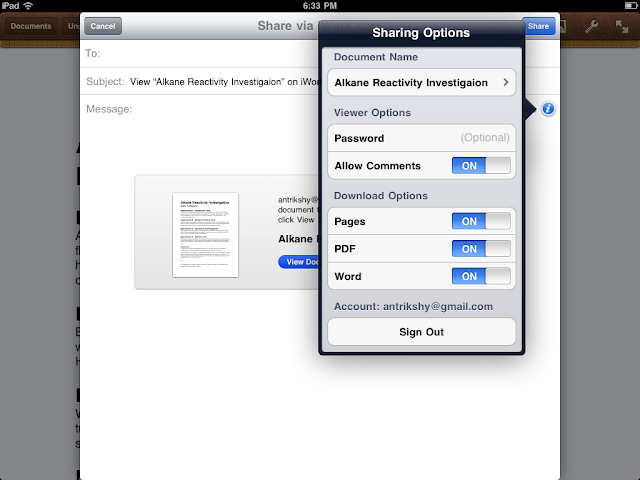
- Several options for sharing documents: I had thought that I will have to connect my iPad to iTunes every time I wanted to transfer documents back and forth. I was wrong. There are many more ways to share documents with others "or even yourself" as Apple puts it. You can send your doc to iWork.com and email someone else (or yourself) the link. You can also send a document in an email directly. When picking any of the options, you can choose to export your doc as a PDF, Word (no *.docx) or Pages file, which I liked a lot.
- Clean interface: The first time you open the app, don't be fooled by its minimalist, bare-bones look into doubting its feature-richness (is that a new compound word?).
- Compatibility with MS Office is good: As a Microsoft Office and Windows user, I was astonished with the way documents created in Office 2010 rendered and worked with Pages for iPad. Don't expect all fonts that come with Windows to be available in Pages, though Apple's selection is good enough. Don't expect complex SmartArt or headers and footers to work well. But I didn't feel handicapped when working with them.
- No kind of Dropbox or other file syncing support: While the features to share and transfer documents over the Internet suffice for me, lack of ways for Dropbox to work with Pages on the iPad still nags me. It would have been so much better if iOS had a file system.
- There could be more templates: Don't get me wrong. The templates built into Pages are good for most people. But there are not many of them. I don't know what I am expecting, but the fifteen in-built templates do not compare with the vast amount available for Office from Office.com.
- Not as full-featured as desktop apps: I know that Pages for iPad is a mobile office app. But there is a long list of missing basic features that could have been available in Pages easily. For example, I cannot find any way to format text as subscript and superscript.
- Zooming is crippled: This is not a very big grievance (and in no way a dealbreaker!), but for some reason, Pages does not seem to allow you to zoom into documents in the same way you zoom into webpages. You can simply zoom into 'Actual' and 'Fit'.
- Slightly overpriced: I am surprised at the fact that Pages is priced at $9.99 while apps like GarageBand and iMovie cost half as much. I haven't purchased the iLife counterparts for the iPad, but I have tried them out at the Apple store. There is no way I can compare Pages to GarageBand. In fact, Apple should give away iWork for iOS devices as complementary downloads.
Despite all the minus points, I still think Pages is a must-have app for the iPad. The main reason for this is its superiority among other office apps. However, don't expect to use it to type up really long and complicated math or science essays on it. Also, don't expect it to use it without a desktop application unless you are typing up a basic and relatively short paper.


